Optimizing a website for performance is essential to enhance user experience and boost search engine rankings. Two critical metrics from Google’s Core Web Vitals (CWV)—Largest Contentful Paint (LCP) and Cumulative Layout Shift (CLS)—play a significant role in measuring and improving a site’s performance. These metrics outline the key strategies for optimization of Core Web Vitals and highlight the observed impact on both mobile and desktop performance.
Understanding Largest Contentful Paint (LCP)
LCP, a key metric in Core Web Vitals, measures the time it takes for the largest visible content element (such as an image, text block, or video) in the viewport to load and become visible. It serves as a crucial indicator of how quickly users perceive a page to be fully loaded in the Core Web Vitals metrics. The ideal target for LCP is less than 2.5 seconds.
Understanding Cumulative Layout Shift (CLS)
CLS, another key metric in Core Web Vitals, tracks unexpected layout shifts during a page's lifecycle. These shifts can cause frustration, especially when users are interacting with a page, such as clicking a button or reading text. The ideal target for CLS is less than 0.1.
Core Web Vitals: Strategies to Optimize LCP
Image Optimization: Compressing images and converting them to WebP format ensures the largest visible elements load quickly. This reduces the time needed for rendering the key visual components.
Implementing Lazy Loading: Applying the loading="lazy" attribute to non-critical images defers their loading until they appear in the viewport, prioritizing above-the-fold content.
Leveraging a Content Delivery Network (CDN): Using a CDN to deliver assets from servers closer to users reduces latency, improving performance across regions, particularly for mobile devices.
Minimizing Render-Blocking Resources: By minifying JavaScript and CSS and deferring non-essential resources, browsers can focus on loading critical content faster.
Desktop-Specific Optimization:
- ● Preload key desktop fonts and images to prioritize their rendering.
- ● Enable HTTP/2 to improve desktop asset loading efficiency.
- ● Optimize the layout structure for larger screens to avoid overloading above-the-fold content with unnecessary elements.
Utilize Critical Path Rendering:
- ● For desktop layouts, prioritize loading above-the-fold content by identifying critical CSS and inlining it directly in the page's .
- ● Use server-side rendering (SSR) to pre-render content that takes longer to load, reducing the time to the first meaningful paint.
Desktop-Specific Image Scaling:
- ● Serve larger, high-resolution images tailored for desktop screens while ensuring responsive breakpoints to prevent overloading resources.
- ● Implement next-gen formats like AVIF for desktop images where quality is a priority.
Browser Caching for Static Assets: Leverage long-term caching strategies for static desktop assets (e.g., CSS, JavaScript) to ensure repeat visits load faster.
Core Web Vitals: Strategies to Optimize CLS
Setting Dimensions for Media Elements: Explicit width and height attributes were added to images and videos to reserve the necessary space in the layout before the content is loaded.
Reserving Ad Slots: Dedicated placeholders were implemented for ads, ensuring that their late loading does not disrupt the layout.
Font Loading Optimization: Applying the font-display: swap property for web fonts allowed text to remain visible while fonts loaded, eliminating layout jumps caused by font changes.
Refining Animations and Transitions: Transition effects that trigger layout recalculations were avoided, ensuring smoother interactions without unexpected shifts.
Desktop-Specific Refinements:
- ● Reserve space for high-resolution assets commonly used on larger screens.
- ● Use adaptive image scaling to maintain layout stability when switching between resolutions.
Dedicated Space for Widgets: Allocate fixed dimensions for interactive desktop widgets, such as chat boxes or product filters, ensuring their dynamic behavior does not cause layout shifts.
Custom Desktop Layouts: Design desktop layouts with grid systems to ensure predictable alignment and spacing, even when content dynamically updates.
Optimize Pagination and Infinite Scrolling: For desktops, ensure that pagination or infinite scrolling does not shift content unexpectedly. Use placeholders for newly loaded content to maintain layout stability.
Performance Improvements of Core Web Vitals
Tests conducted using tools like Google PageSpeed Insights and Web.dev revealed significant performance improvements in the Core Web Vitals after adopting these strategies.
Testing Methodology:
For example, we can evaluate a sample website with a focus on both mobile and desktop experiences. The website's key visual elements include high-quality images, interactive buttons, and dynamic ad content.
Ideal Targets of Core Web Vitals:
For LCP: Below 2.5 seconds.
For CLS: Below 0.1.
Mobile Results:
Before Optimization:
LCP: 4.2 seconds (Exceeds the ideal target).
CLS: 0.2 (Above acceptable levels).
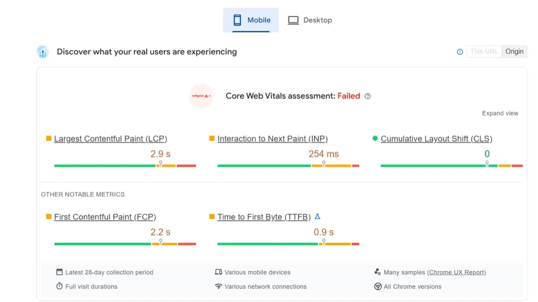
After Optimization:
LCP improved to 2.3 seconds.
CLS reduced to 0.05, well within the ideal range.
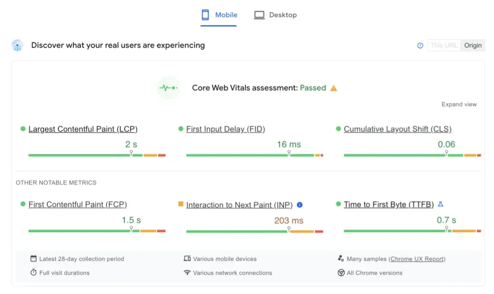
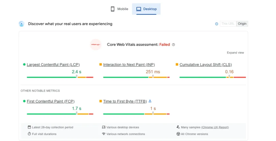
Desktop Results:
Before Optimization:
LCP: 3.1 seconds (Room for improvement).
CLS: 0.12 (Acceptable but not optimal).
After Optimization:
LCP achieved 1.8 seconds, surpassing the ideal target.
CLS reduced to 0.01, eliminating noticeable layout shifts.
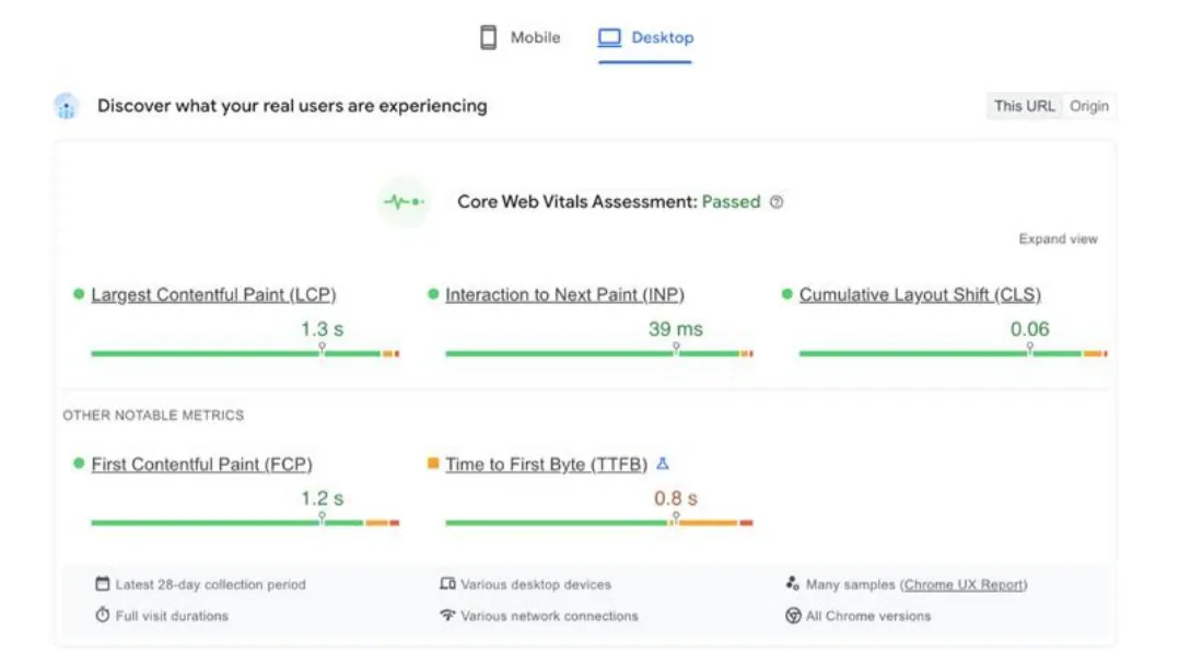
The improvements on desktop are particularly noteworthy due to enhanced CDN efficiency, strategic asset preloading, and layout adjustments tailored for larger viewports.
Recommendations for Continuous Optimization of Core Web Vitals
Prioritize Key Visual Elements: Optimize the largest visible content to meet LCP targets consistently.
Stabilize Layouts: Reserve space for all dynamic elements, such as ads and images, to minimize CLS issues.
Regular Monitoring and Testing: Use tools like Lighthouse and Web.dev frequently to track and refine Core Web Vitals’ performance metrics. Test various scenarios (e.g., heavy traffic, slow connections) to ensure stability.
Tailored Desktop Monitoring:
- ● Perform separate testing for desktop and mobile platforms to address unique performance bottlenecks, such as larger screen resolutions and interactive elements.
- ● Use desktop-specific test profiles in tools like Lighthouse to simulate slower network conditions, large viewport dimensions, and high-DPI screens.
Focus on Desktop-Only Features:
- ● Optimize Core Web Vitals’ performance for desktop-exclusive features such as multi-column layouts, hover effects, and large-scale carousels.
- ● Ensure these features are lightweight and do not hinder overall performance.
Integrate Real User Metrics: Utilize Real User Monitoring (RUM) tools to collect desktop-specific data on user behavior and identify issues impacting LCP and CLS.
Periodic Benchmarking: Compare your site's desktop performance against competitors and industry benchmarks to identify opportunities for further optimization.
By implementing these strategies, websites can deliver faster, more stable, and user-friendly experiences across all devices, significantly enhancing usability and search engine visibility.
