In a data-driven world, effective visualization is essential for analyzing complex datasets. Well-crafted visuals simplify intricate information, enhance storytelling, and make insights more accessible. Among the many tools available, Matplotlib and Plotly stand out as two of the most widely used Python libraries for data visualization. Each offers distinct features catering to different user needs. Let's explore their strengths, differences, and ideal use cases.
Getting Started: Understanding the Basics
Matplotlib: The Classic Powerhouse
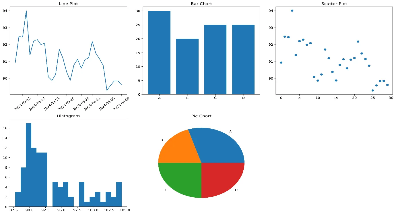
If you're coming from a scientific computing background, Matplotlib will feel familiar. As the foundation of Python visualization, it offers granular control over plots, making it ideal for research papers and static reports. With a few lines of code, you can create line charts, bar graphs, and scatter plots with precision. While it lacks built-in interactivity, its reliability and extensive customization options make it a go-to for academia and engineering.
Plotly: The Interactive Game-Changer
Plotly brings data visualization into the interactive age. It generates the same charts, scatter plots, and bar graphs as Matplotlib, but with added interactivity—hover over any data point, and tooltips, zooming, and dynamic updates happen effortlessly. With zero additional code, you get sleek, responsive visuals perfect for web-based applications and dashboards.
Advanced Visualization Techniques
Matplotlib: Deep Customization and Flexibility
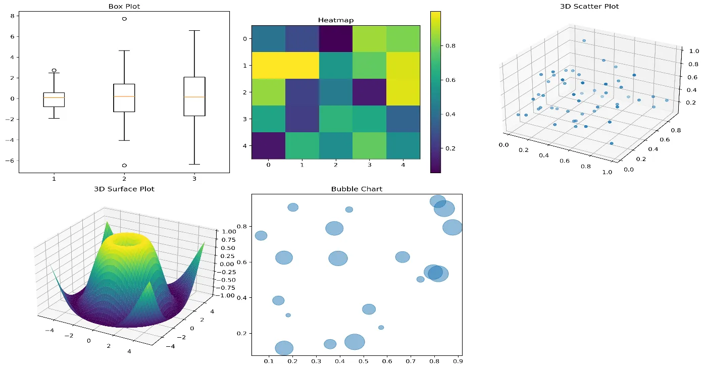
For users who demand absolute control, Matplotlib excels in advanced customizations. Whether you need to create multi-panel dashboards with shared axes or fine-tune histogram bins, Matplotlib offers unmatched versatility. Think of it as an artist’s toolkit—everything is at your disposal, but mastering it takes effort.
Plotly: Built for Modern Interactive Experiences
Need a 3D plot that users can explore? Or interactive subplots where selecting data in one graph updates another? Plotly handles these features natively. It's a top choice for real-time animations and web-friendly dashboards, making it indispensable for industries that rely on live data visualization, such as finance and tech.
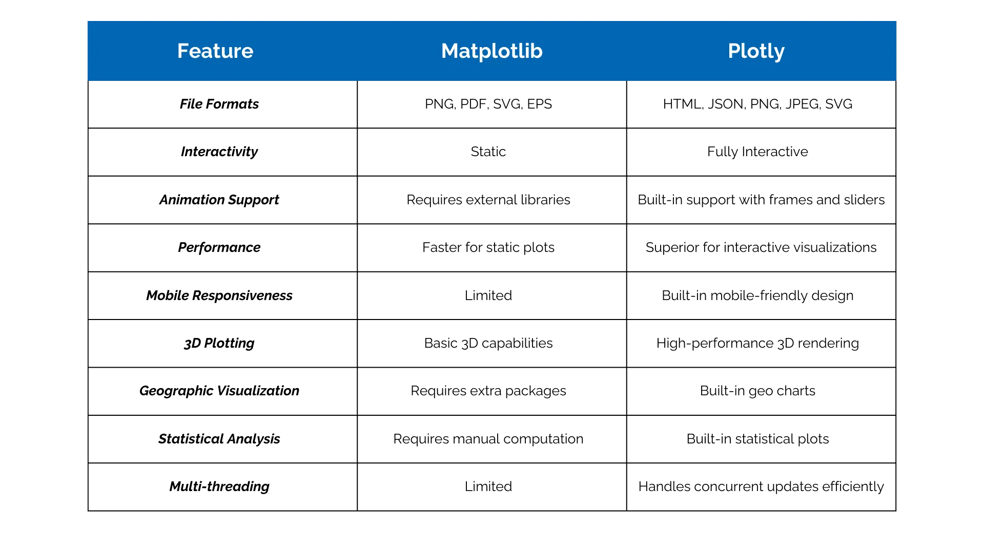
Matplotlib vs. Plotly: A Feature Comparison
Choosing the Right Library: Key Considerations
Industry-Specific Recommendations
- ● Finance & Trading: Plotly is the winner for real-time market analysis and interactive dashboards.
- ● Academic Research: Matplotlib remains the best for scientific publishing.
- ● Healthcare & Medical Imaging: Matplotlib provides better control over color mapping and precision.
- ● Tech Startups: Plotly’s modern stack makes it ideal for MVPs and rapid prototyping.
Project Scale Considerations
- ● Small Teams (1-5 people): Start with Matplotlib for easy maintenance.
- ● Medium Teams (5-20 people): Plotly offers better collaboration features.
- ● Enterprise-Level Projects: Use both—Matplotlib for data pipelines, Plotly for front-end visualization.
Budget Considerations
- ● Matplotlib: Completely free and open-source.
- ● Plotly: Free for most applications, but enterprise features require licensing.
Final Verdict: Which One Should You Choose?
For individual data scientists and researchers, Matplotlib remains the preferred choice for static, publication-quality plots. However, for teams building interactive, web-based applications, Plotly offers better usability, interactivity, and web integration.
Best Approach? Use Both!
- ● Matplotlib for data analysis and processing.
- ● Plotly for presenting insights in interactive formats.